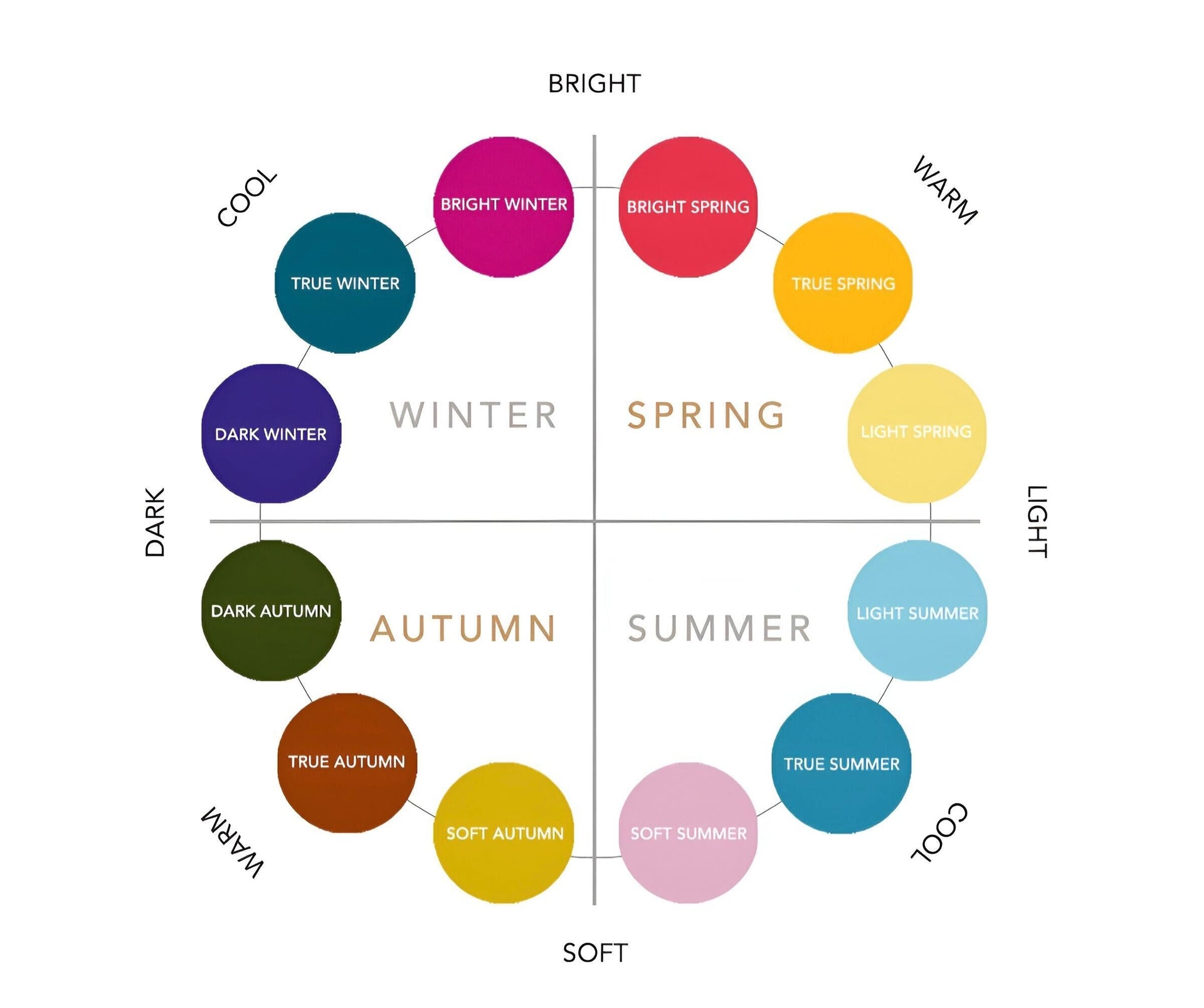
Seasonal colour analysis is a structured way of understanding which colours naturally suit your skin tone, contrast, and overall colouring.
In jewellery, this translates into two decisions: which metal works best on you, and which gemstone colours feel natural versus forced.
This guide connects the four seasonal colour directions to Atlas Carré metals and gemstone colours, giving you a clear starting point without restricting how you wear colour.
Spring - Warm, Bright, and Fresh
Spring colour palettes are defined by warmth, brightness, and clarity. Colours feel fresh, luminous, and energetic, never muted or heavy.
This palette reflects early spring - light, warm tones combined with clear, vibrant accents.
Spring is typically divided into three directions:
- Light Spring: soft, warm pastels such as blush pink, pastel blue, light yellow, and fresh green
- True Spring: clear, warm colours like golden yellow, coral, tangerine, and grass green
- Bright Spring: higher contrast tones with added intensity, including fuchsia, aqua, and vivid green
Across all three, the defining quality is warmth combined with clarity. Colours should feel clean and radiant rather than dusty.
In jewellery, this translates into pieces that feel light, luminous, and easy to wear.
Best metals: Yellow gold works naturally with Spring undertones.

Colours: Light Pink Sapphire, Yellow Sapphire, Colombian Green Emerald, Light Blue Aquamarine
Shop this palette:
Pink & Red |
Yellow & Orange |
Green |
Blue
Summer - Cool, Balanced, and Refined
Summer colour palettes are defined by cooler undertones and an overall sense of balance. While often described as soft, Summer can range from delicate to bright, as long as the colours remain cool and cohesive.
The palette reflects diffused light rather than sharp contrast, creating a more blended, harmonious effect.
Summer is typically divided into three directions:
- Light Summer: airy, cool tones such as soft blue, pale pink, and light neutrals
- True Summer: balanced cool colours like lavender, rose, and blue-grey
- Soft Summer: more muted, blended tones with lower contrast and a slightly greyed finish
Across all three, the defining quality is coolness with integration. Colours should feel connected rather than sharply separated.
In jewellery, this translates into pieces that feel refined, balanced, and quietly luminous.
Best metals: White gold enhances cooler undertones and maintains clarity.

Colours: Vivid Pink Sapphire, Purple Amethyst, White Diamond, Light Blue Aquamarine
Shop this palette:
Pink & Red |
Purple |
White |
Blue
Autumn - Warm, Rich, and Deep
Autumn colour palettes are warm with more depth and intensity. Colours feel richer, heavier, and more grounded compared to Spring.
This palette reflects late summer and autumn landscapes - earthy tones combined with deeper, saturated colour.
Autumn is typically divided into three directions:
- Soft Autumn: warm, muted tones such as dusty green, warm beige, and soft terracotta
- True Autumn: rich, warm colours like burnt orange, olive green, and deep gold
- Deep Autumn: darker, more intense tones including deep red, forest green, and warm brown
Across all three, the defining quality is warmth combined with depth. Colours should feel full and grounded, not light or airy.
In jewellery, this translates into pieces with presence - richer tones and warmer metals.
Best metals: Yellow gold complements the warmth and depth of Autumn colouring.

Colours: Orange Padparadscha Sapphire, Deep Red Garnet, Zambian Green Emerald, Teal Blue Spinel
Shop this palette:
Yellow & Orange |
Pink & Red |
Green |
Blue
Winter - Cool, Clear, and High Contrast
Winter colour palettes are defined by contrast and clarity. Colours are cooler, sharper, and more defined, creating a striking overall effect.
This palette reflects crisp light and strong contrast rather than softness or blending.
Winter is typically divided into three directions:
- Bright Winter: vivid, high-contrast colours with strong clarity
- True Winter: balanced cool tones with strong definition
- Deep Winter: darker, more intense colours with added depth
Across all three, the defining quality is contrast. Colours should stand out clearly rather than blend together.
In jewellery, this translates into pieces that feel sharp, defined, and visually striking.
Best metals: White gold enhances contrast and keeps the look precise.

Colours: Red Ruby, Blue Sapphire, Colombian Green Emerald, White Diamond
Shop this palette:
Pink & Red |
Blue |
Green |
White
How to Use This
This framework is a starting point, not a restriction.
Most people don’t fit perfectly into one category, and your preferences will always matter as much as your undertone.
Use this as a guide to choose your base metal and your first gemstone colour. From there, you can layer and combine freely.
Atlas Carré is designed as a system where colours work together, not in isolation.